Some time earlier this winter the consultant for Cherriots' Long Range Plan published an "existing conditions" report. It does not appear to set up the planning for optimal success.
 |
| Existing Conditions, December 2021 |
Just seven years earlier, a different consultant published their version of the same report type. It was much longer.
 |
| Existing Conditions, March 2014 |
An update to any "existing conditions" report is, of course, prudent, but the 2021 version makes no reference to the 2014 version, and completely omits what would be most useful: A section on "what has changed." It's almost like a wilful disregard for or discounting of what earlier consultants and processes had developed. If nothing else there should have been a section reviewing previous plans, like there is in the 2014 report. There's too much reinvention of the wheel and not enough development in new directions.
 |
| 2014 report longer and more detailed (comments added) |
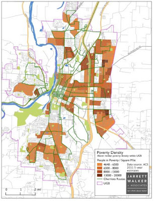
At a glance, the information design also seems inferior.
Here are the two maps of low-income households, one from 2014, the other from 2021.
 |
| Poverty on the 2014 map |
 |
| Low-income on the 2021 map |
Because the heat-map in 2021 uses the same color as parkland, it's much harder to parse the 2021 map. The 2014 map uses a different color scheme, distinct from the green for parks. It also uses a hard threshold to zero out many census areas as not having useful information on this particular question. The 2021 map shows a whole continuum, and camouflages the most important information. It is much harder to read. In nearly every way the 2014 map presents the information better.
The most interesting question is also, what has changed from 2014 to 2021 (or from the survey dates of 2011 to 2019)?
What's the delta? Since there was this detailed report from 2014, the whole 2021 report should have been written as an update to the 2014 report and concentrated on changes from that.
As it is here now, a new consultant is largely duplicating the work of a previous consultant instead of building off the previous work.
Here's another pair of maps, this time from the 2017 Needs Assessment report and again the 2021 Existing Conditions report. One the one hand, both use a green scheme, but the underlying data is hard to reconcile. Shouldn't the maps look more similar?
 |
| Car-free households in 2017 |
Look at the land on either side of Lancaster Drive. On the 2017 map it seems to show a lot of car-free households. But the 2021 map seems to show considerably fewer.
The 2017 map shows counts of households, and the 2021 map shows percent. A very sparsely populated area with several car-free households might skew with a very high percent, like the wedge out towards Turner, even though the actual count of people is low. Equally, a dense area with a lower percent still might have a high number of people who could be served.
 |
| Car-free households on 2021 map |
For an analysis of bus service, we are more interested in the total count of people who might be served rather than the percent of some unknown total. Not only does this make the apples-to-apples comparison difficult, it hides the most salient details. Counts are more important in this context than percents.
This again does not seem like the best information design on the 2021 map.
 |
| The pilot program was not very successful! |
Finally, the tone in the discussion of the on-demand "Connector"
service, short-lived and abandoned a few years ago, is oddly
Pollyanna-ish. It was a pretty clear failure, not a "successful"
expansion. It was worth trying, but saying it was any kind of "success" is a real stretch, perhaps flattering the client a little. If the consultant cannot speak clearly and plainly about that project,
there is reason to think they might not be clear and critical enough
about future planning.
This is not a comprehensive review of the 2021 Existing Conditions report. You might find in it elements or analytical moments that seem like real advances. Maybe a longer version of the document is circulating privately and not published for the public. But just in a holistic sense, from here and about the document we have, there are concerning signs that the analysis is a little superficial and the final reports and recommendations may not be as good as they could be. As the opening statement for the Long Range Plan, it is underwhelming.


No comments:
Post a Comment