 |
| Minto Bridge on May 4th, via Travel Salem |
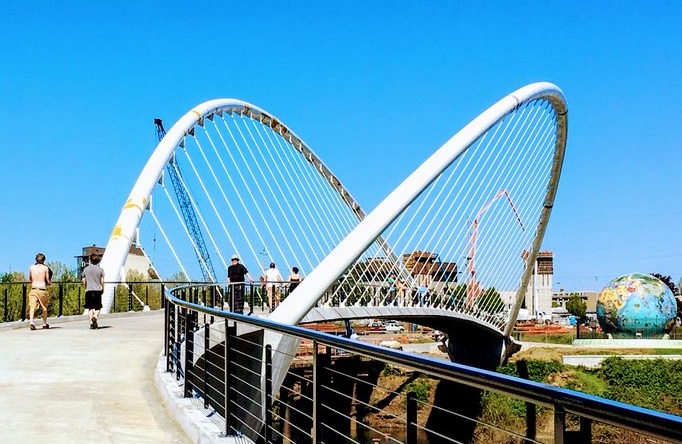
Those profile views make it look low and wide. The plans called for a 50 foot peak, and it is possible that the arches are only 50 feet high. But I swear the arc shown here in the initial drawings is flatter than the arc as-built. If so, the peak may be more than 50 feet high. (There may be more to say on this later, as there are almost certainly engineering constraints driving the details, which we might instead want to consider primarily aesthetically rather than structurally.)
 |
| Original Council-approved concept drawing (2010) |
 |
| The drawing showed a 50 foot peak - it looks too flat now |
 |
| The arches are much bigger than the person painting them |
 |
| They're as thick as a half-size human is tall |
The whole package just seems over-sized. In total, there are three details I find distracting:
- The bridge splays out at top, with the arches angled and spread outward. (Wags have called it a "taco shell," the "taco bridge.")
- It almost looks tensioned skyward, like a hand is pulling the arches up; it's taller than expected and dominates the skyline. Its energy is tensile rather than flowing.
- It has huge diameter tubing that is stocky rather than graceful.
 |
| Similar bridge over McLoughlin Blvd along Springwater Trail OBEC, 2007 |
- Span a shorter distance
- Be pinched at top, the the arches closer together and actually tied
- Use smaller diameter tubing for the arches
- Require a lower arch peak (this may be an illusion because the pathway is positioned higher in the arch)
Whatever may be the case, I now wonder if a plainer design might actually better feature the slough and wildlife and city skyline.
 |
| Eugene's Greenway Bike Bridge, completed in 1978 |
 |
| The two low clearance candidates (December 2008) |
Based on this information, there is no real way to second-guess the decision. The tied-arch design was handsomer and better. Based on the information they had, Council made a good and wholly defensible decision.
Even so, now in hindsight, and as the design of the tied-arch evolved, it is possible to cast a backwards and wistful glance at the plainer, "precast concrete girder" design.
But again, you may disagree, and on this it is not possible to be dogmatic!
(The real lesson here: Bridges cost more than you think! The total cost for the Minto bridge was double the estimates here. If the SRC is estimated at $430 million, and you think that estimate is credible, think again!)
Walking and biking counts have averaged 5,000 trips per day since it opened, so people are using it. Salem's street classification identifies the mid-sized "collector" street as designed for 1,600 to 10,000 trips per day, and the "minor arterial" for 7,000 to 20,000 trips. Right now, anyway, the bridge is a "collector" and nearly a "minor arterial"!
What is your opinion of the bridge and path? How do you experience the bridge design and its procession of natural and architectural forms?


4 comments:
I believe the Minto arches are technically somewhat lower than 50', since the 50' dimension is parallel to the arches, and they are 25° from vertical. But...it is 5 stories high and over 300' long: quite simply, it *is* big.
The diameter of the arch tubes is 30" - I think the conceptual drawings might have depicted 24" diameter tubes. Tangentially, both of the 2008 renderings depict a flat deck, which I expect is due to a non-bridge person creating them: bridge decks always have a vertical curve, so the renderings both look deceptively flat.
My opinion of the bridge? Not great. The term "magpie architecture" comes to mind. I remember someone comparing "signature" bridges to Swiss watches: lots of unique, fiddly little parts with which to fuss. I find it difficult to think of an argument where this design is necessarily superior to a "simple" concrete or steel girder bridge, which would have provided a bridge in less time, undoubtedly at a lower cost, and may (or may not) have been more aesthetically pleasing.
It was never about anything but being a 'signature bridge' for Mayor Peterson. Ironically, this bridge is not unique. I did a Google search and found several just like it. But one might say that from a distance at least you can see this bridge, so I guess it met that goal.
Salem Community Vision put forward a suggested bridge that was less flashy but was in keeping with the historical nature of downtown with low rails and lamp posts like downtown. It was likely to cost about $3 million. But it did not even get a hearing.
Oh well, it is too late to wish we had something else now.
I think this is what happens when you have decisions made in a back room and then brought out for public comment...that is really not listened to very seriously.
I love how Salem Community Vision can do every City project for half price. That's amazing.
I for one think the bridge looks great. People can certainly quibble over the architectural details or the driving force for building the bridge, but in the meantime lots of people are enjoying a nice new addition to the City.
It's not that outlandish a claim (that SCV can find ways to do projects for half of what they're being sold for) --
First, SCV gets to pick which projects it analyzes and critques and then publicizes the critiques. The ones you hear about are the ones they talk about -- which would be the ones where they're able to make claims for savings.
Second, public projects are pretty well established to suffer from horrifically bad budget estimates; this blog has had many posts showing credible research that details how strong the incentives are for projects to be oversold and under-delivered. Observers who don't stand to benefit from the gravy train often can find waste in public works projects, because all the players on the YES side have only weak incentives to keep costs down.
Third, both the Courtney Bridge and the new police HQ are examples of where the basic functions could indeed have been met adequately for far less. Peoples' feelings about the ornamentation on the bridge is a matter of taste, but it's clear that the functionality that is what is so popular (providing access to Minto from downtown rather than from the River Road access) could have been attained for far less.
The police HQ is a far more egregious example of cost bloat and a real value engineering study of functions and needs could have been very very informative. Any project that is first sold hard as just fine at 75,000 sq ft in spot A and is then sold even harder as needing 150,000 square feet at spot B is giving off a strong smell of bloat and pork to feed the contractors.
Post a Comment