At the OTC meeting last week ODOT proclaimed great new progress on emissions.
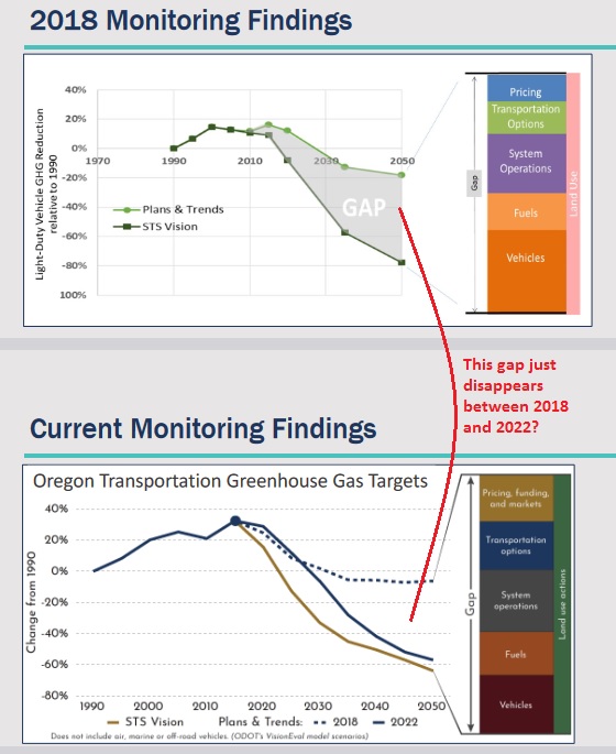 |
| Did we really do that much in four years? |
To support this they've rolled out a new "dashboard." It is propaganda more than sober analysis, a bit of a slick farrago. (Old dashboard here.)
 |
| New dashboard home page |
In general terms, the structure of the dashboard is hard to parse. Everything is hidden. A paper report has a table of contents, pagination, an executive summary, and appendices. You can grasp the whole shape.
Here with a website only, those elements and any structure are concealed. Who knows how deep you might have to click to find something. The structure is designed to look informative, but in in fact it obfuscates. If the progress were truly so great, the structure would be more transparent and easier to parse.
 |
| Meagre comparison section |
More specifically, it lacks any detailed discussion of what changed between the 2018 forecast and 2022 forecast. It waves away all the changes as a product of the new Executive Order, but does not drill into detail. Those three paragraphs just above are it!
It is also incoherent.
 |
| New dashboard on VMT |
The optimism of the new forecast assumes driving habits will change, but here in a discussion of VMT, the dashboard is much more pessimistic. If Oregon's driving habits won't change much through 2050, a 60% reduction is very dubious.
A different kind of incoherence arises with walking, biking, and rolling.
| Old dashboard on options |
On the old dashboard they showed half-moons for partial progress on biking and walking. In the new dashboard they've upgraded to nearly full moons, signifying "strong progress." Have things changed so much in four years? From here the answer is a clear no.
| New dashboard on options |
On bike, walk, roll, in a detail section they say "it will take roughly 150 years to close gaps in walking and biking infrastructure."
BikePortland, in fact, yesterday published a story about the biking leader in Oregon, "City counts reveal data behind Portland’s precipitous drop in cycling":
just nine years ago (in 2013) PBOT says there were 3,478 people riding bikes in the central city. During the counts last summer, there were just 1,122 people on bikes — a 45.9% drop. Across 184 count locations, PBOT tallied 17,579 people biking in 2022, a 37% drop from the 27,782 counted at the same locations in 2019.According to the Census, Portland’s bike-to-work percentage plummeted to just 2.8% in 2021 — down by almost half from the 5.4% in 2020 and well off our nation-leading peak of 7.2% in 2014.
Salem, of course, is not any better.
 |
| New dashboard on biking |
Neither the decline in Portland nor the 150 years to complete the network looks anything like "strong progress." If there is not an actual plan in place to accelerate completion of the network, any optimism is simply hand-waving and magic.
Additionally, if we have met our goals for transportation demand management - those filled in moons - but we are still working on widening I-5 at the Rose Quarter, and widening I-5 from Kuebler to Albany, is there anything meaningful about those goals? Wouldn't traffic projections in analysis for capacity increases show that we don't need that new capacity? More likely the full moons are just empty blather. The nearly full ones for bike, walk, roll also seem inflated. And how about the precipitous decline on transit goals? That is strange, especially given the top-line optimism.
Finally, the section shifts between measuring construction and measuring behavior. The old dashboard measured "percent of urban state highways with bike lanes and sidewalks." It was all about construction and potential, theoretical options, not what people actually do, which is what actually affects emissions.
The new dashboard retains some measurements on construction, but also appeals to Household Survey data from 2009-2011, saying "about 12% of adults in Oregon walk, bike, or roll to their destinations." The citation is actually for 11%, but that's not terribly important. What is important is that data from 2009-2011 was the same for the forecast in 2018 and the forecast in 2022. There are no grounds from this one data point to infer any great progress. And from the Portland bike counts, it looks like there are strong grounds to infer a lack of progress. While it looks like the dashboard appeals to actual behavior, it misuses that data for unwarranted optimistic ends. Moreover, it fails to use the best data, like the latest counts in Portland.
It is reasonable to measure both construction and behavior, but we should have metrics for both separately, and should have analysis of the way they are related. And in the end, it is what people do that matters, not intent or theory.
Hopefully others will drill into other sections or be able amplify in more detail. But at a glance, there is little reason to trust the optimism of the new forecast and to trust the new dashboard. You might be able to quibble with one criticism here or another, but on the whole the dashboard looks like slick bells and whistles and greenwash rather than substance.
ODOT has a pattern of deception, and this does not look like some new trustworthy analysis. It looks instead like telling the bosses what they want to hear.


1 comment:
The great Edward Tufte’s book “The Visual Display of Quantitative Information” has obviously been a reference for them —- as in, a menu of ways to obfuscate reality and make it seem much more like progress. They clearly used that and Darrell Huff’s “How to Lie with Statistics” as instruction manuals rather than the “how to recognize BS” that they were intended as.
Post a Comment