Most suburban style development in Salem places a large parking lot along the street and the mass of the building parallel to the street in back. Newer development like that on north Broadway, as well as older development like our historic downtown, places the building on the sidewalk and any parking in back.
This move splits the difference so you get a profile view - a jolt in the streetscape, a little hip-check and elbow?
So first off, what is its name? I can't even figure out how to google for this! (Any architect readers know?)
And does it work? Does it liven things up?
 After Silver Falls Bank went under, the old Izzy's space was leveled and a new little strip mall went up.
 Vista Place is the first time I noticed this style of building siting. I think just one bay is yet to be filled and the parking lot often is full - but that's the thing: It remains totally auto-oriented.
 I didn't think much more about it until two clinics went in recently. CB|Two has also used the plan's structure for the new Willamette Urology Clinic. (Does anyone know of examples from the 20th century?)
This building looks distinctly suburban, though, with the gabled entry (a little snouty), stone detailing, stone wall and lawn. Does it greet the street any more than if it backed into the street? Maybe. But it will probably age as well as similarly styled malls. One might hope for something more.
The west Salem Clinic and Edgewater
A little more urban in form, it seems to me, is the boxy modernism of the new medical clinic in West Salem (at top). I couldn't get behind the fencing, of course, but I like the massing and harmony. I find it more urbane, and I think it will age better.
But it's not oriented towards Edgewater and a potential person on foot. It's flat and spread out, all single-story development. Bark mulch landscaping also fills a gap between the sidewalk and building, and the set-back seems overly generous.
Sure, it's a medical clinic. When you're not healthy, you're not likely to be walking or biking, but for regular checkups it would be nice to encourage that. And for the general health of the neighborhood streetscape it seems like it would be so much nicer to have something more mixed use. Hospitals, too, manage to stack floors, so the primary function as a clinic shouldn't necessarily rule out a multi-story structure.
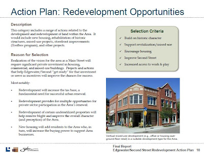
The Edgewater Overlay Zone appears to encourage mixed use kinds of development and buildings of two or more stories. The overlay does not demand, but appears to encourage, "main street" kinds of design. Even clearer is the February 2010 Edgewater Redevelopment Action Plan (p. 18 above). It shows a two-story main street style mixed use building with corner entry.
This clinic and lot may represent a missed opportunity.
In any event, I don't think the right-angle orientation really works. The building's footprint is about a quarter of the parcel - but 3/4 of it are parking! The lot is huge, extending well to the left of the image here. On Edgewater, there's no window shopping, no inviting entry, there's no real element of visual or social interest in the streetside building face. As streetscape, the Edgewater facade is more inert than enlivening. (Certainly a need for privacy contributes to this - but surely better design can combine a lively building edge with privacy!) On the side street, Patterson, there's a separate entry with different suite number. It's a little bit better, but still not very active.
The building and lot scale to the block. The development joins a dialysis clinic with a large parking lot on the same block. Single-purpose buildings with large car storage together take up 3/4 of this block on Edgewater - the proportion just scales up. If the goal was to diversify with a modest increase in density, we aren't succeeding. The site will be empty after hours, as desolate as the neighboring industrial sites or the Capitol Mall.
I look forward to the fencing removal and building opening. Once you can actually walk around, the experience of the building, the subjective and experiential dimension, may change. But until then, I'm not persuaded that the 90 degree twist really addresses the needs for walkable, human-scale development.


2 comments:
Parking lots were never put behind buildings before they were put in front, they've always been in front since the horse and buggy days.
On street parking was first. It was right and simple because the building had frontage, then pedestrian space, then parking with the street. When more stalls were needed they added their own side street: front parking lots. This squeezes the pedestrian space between the parking lot and street.
Laws are changing that require a percentage of building frontage be placed adjacent to the road. This unfortunately requires what you've documented with buildings in front, and parking in back or to the side. This doesn't solve the problem, but only adds two car dominated spots instead of just the road.
The new Oak Park Dental offices on Astoria Way NE, just off Portland Road, also look like they exemplify this 90-degree turn.
Post a Comment